UX Strategy for the Digikala Seller Panel Redesign

Leading four designers through a research-first redesign of Digikala's seller experience

About Project
As the primary product of Digikala's Commercial Department, the Seller Panel is a complex platform with numerous features, serving as the hub for our 300,000 active sellers to manage their products, orders, and other routine or seasonal tasks. When I assumed the role of design team manager in 2021, I not only recognized the need for a team restructuring but also identified opportunities to improve the user experience for our sellers.
Year
2021 - 2022
My Role
Design Team Lead, Product Designer

Brief History

What is Digikala Sellers Panel?
The Digikala Sellers Panel is a platform for merchants and retailers to manage and sell their products on Digikala's e-commerce website. The Sellers Panel provides tools and resources for vendors to list, manage, and promote their products to customers on Digikala. It includes features such as product management, inventory control, order management, and analytics, which allow sellers to efficiently run their online businesses on the platform. The Digikala Sellers Panel is a key component of Digikala's e-commerce ecosystem, helping to connect sellers with customers and facilitate sales and transactions.
First insights to the Digikala Seller Panel
In 2016, the process of redesigning the seller's panel was initiated. After a year, the main structure of the panel was published. In late 2017, work began to add more features to the panel, which continued for two years. As a result, by 2020, a large number of features had been added to the panel in a hurry due to a backlog of PM requests and limited resources.

Problems

Lack of a holistic approach in designing the Seller Panel
As mentioned in the Digikala Design Team Restructuring case study, due to the disproportionate number of stakeholders in Digikala's Commercial Department and their requests compared to the design team members, different features and sections of the Seller Panel were designed with various approaches. This resulted in users not being able to experience the Seller Panel as a cohesive product but rather as if several different products had been assembled together.

Extremely high product growth rate
The product's growth rate was so high that users didn't even have the opportunity to familiarize themselves with the new features being added to the Seller Panel. Despite the potential usefulness of these features, they were not being utilized extensively.

Efficiency & Bugs
The existence of fundamental problems in different areas of the Seller Panel, ranging from conversion rates of potential sellers to bugs that have caused difficulties for sellers. Overall, these issues and bugs have not only prevented sellers from benefiting from the new features added to the product, but have also compromised the minimum efficiency of the Seller Panel in certain areas.

An unreliable foundation for growth
The possibility of using the Seller Panel as a reliable platform for future product growth was not feasible given the current state of the product. Although there were numerous business, user experience, operational, and marketing opportunities for product growth, the current product still fell short of the standards required for a mature product, making it unsuitable as a viable platform.

Mobile Version Needed
Based on the data we had, it was found that 70% of Digikala sellers initially attempted to use the Seller Panel through their mobile phones. However, the mobile version of the Seller Panel had not been designed and implemented yet. Despite not having a dedicated mobile version, 20 to 30% of sellers still used their mobile phones to manage their panels in some flows. This high level of demand indicates the need to add a mobile version to the product.

Solution

Given the numerous issues that were evident in the product during the initial investigations, one of the most reliable and challenging solutions I had at my disposal was to redesign the Seller Panel.
My primary reasons for prioritizing this complex solution include the following:

1- Simplify the intricacies of existing processes and make them more practical

2- Creating a seamless experience for the users when utilizing the various features of the Seller Panel

3- Improving the pain points of the users that required a holistic view of the entire user journey map

4- Developing a new design system with enhanced capabilities and the possibility of using it for mobile version design

However, making this decision and implementing it at the level of a large organization like Digikala, and a complex product like the Seller Panel, was a highly risky and complicated task. It required the cooperation and agreement of all teams in the commercial department. I faced challenges in ensuring the decision and getting buy-in from the team for this significant decision.

Challenges

Assurance of the necessity for a redesign
Initially, I had to convince myself of the necessity for this redesign, while being responsible for my other tasks such as redesigning the structure of the UX team and doing my daily design tasks.

Getting buy-in from stakeholders to initiate the redesign project
Given the UX team's position at the time, to start a project like redesigning this complex and large product, I had to present convincing and accurate data to make stakeholders understand the necessity of starting the project.

Proper planning for continuation
Even if the stakeholders and I were convinced of the project's necessity, there were important questions to be answered: How to proceed? What prioritization should be in different teams? How far could we pause stakeholders' requests for new features?

How to overcome challenges

Initial planning for commencement
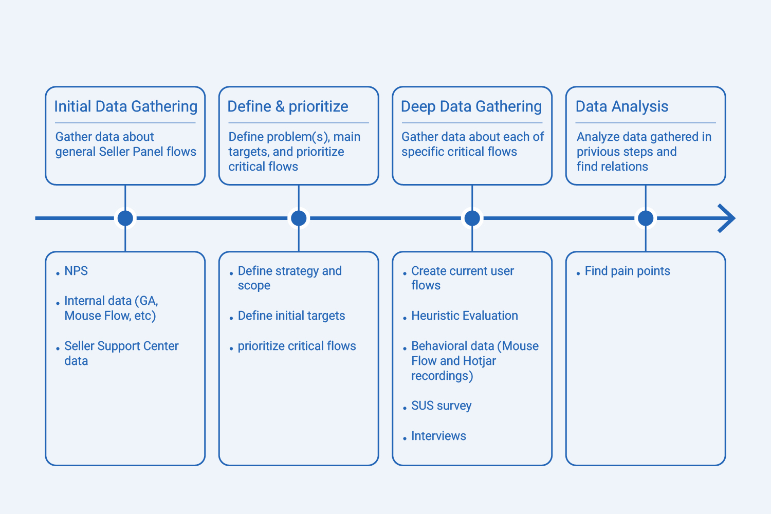
Given that everything seemed to be proceeding as usual within the organization and no one had yet recognized the need for a redesign, the initial energy I could expend on the preliminary steps of this project was not substantial. Therefore, I had to devise a proper plan to initiate the project without compromising my daily responsibilities within the organization. I decided to establish a not-so-lengthy sprint to first convince myself and then the stakeholder team of the necessity to start this project. To shorten this sprint, I sought assistance from my two constant allies, the Product Team and the UX Research Team. The diagram below illustrates a summary of the initial roadmap for starting the project.

1st Step: Initial Data Gathering

1-1. NPS
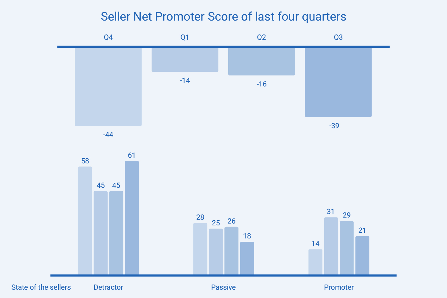
The Net Promoter Score (NPS) of the product for the last four quarters was not positive. A score of -44, -14, -13, and -39 in the respective quarters suggests that a significant number of customers are likely to detract from the product and not recommend it to others. This indicates a need for improvement in the product in order to better meet the needs and expectations of customers.

1-2. Conversion Rate
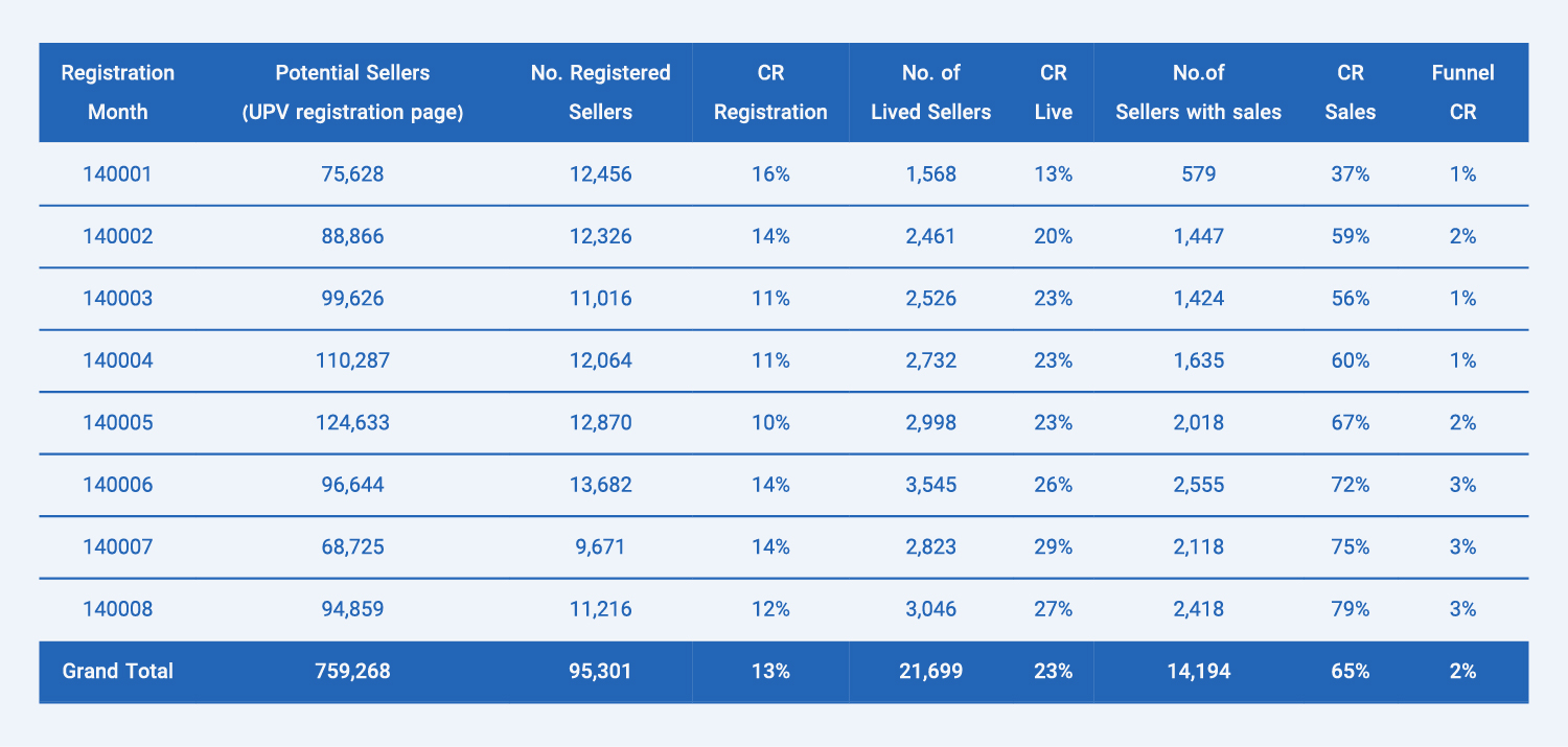
The conversion rate of our potential sellers to active sellers in the first eight months of the current year was just about 2% which did not meet our organizational OKRs.

1-3. Seller Support Center data
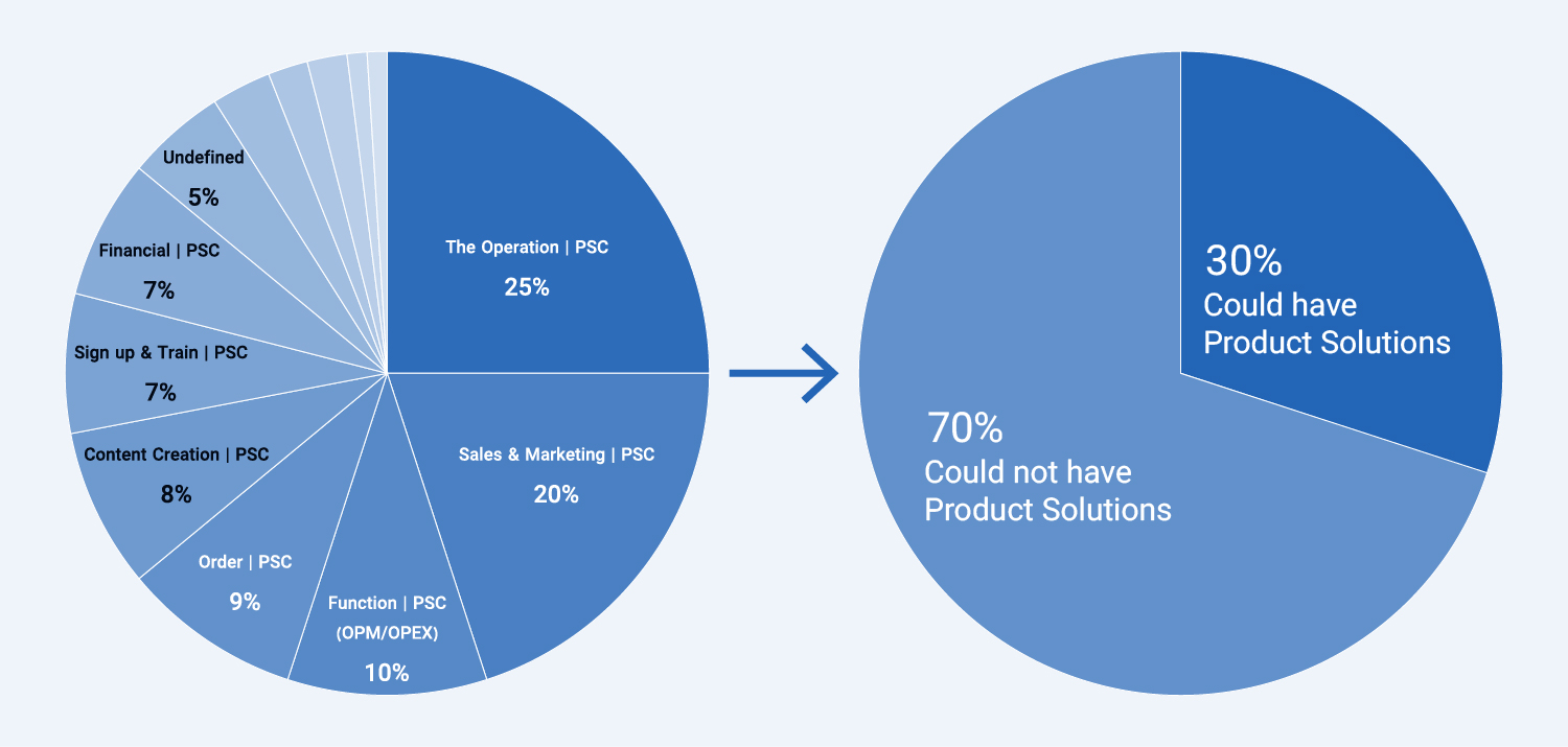
The pie chart shows user problems that led to contacting the Seller's Support Center. Analysis of BI dashboard data revealed an opportunity to address at least 30% of these problems with product solutions to enhance customer experience and satisfaction, reduce support requests and improve support center efficiency.

1-4. Information Architecture
Analyzing the existing information architecture enabled me to identify duplicates and address any complexities in the panel's flow.

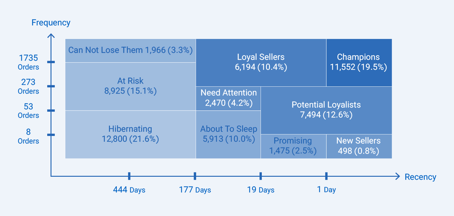
1-5. RFM
With the help of the product management team, I created RFM segmentation model for use in the following steps.

2nd Step: Define & Prioritize

2-1. Defining goals
Based on the information I have gathered thus far, the following objectives were established:

  • Decrease support tickets through the measurement of ticket numbers
  • Enhance engagement through the measurement of conversion rates
  • Improve sellers' satisfaction through the evaluation of NPS and SUS
  • Streamline critical flows by measuring the rate of flow failures.

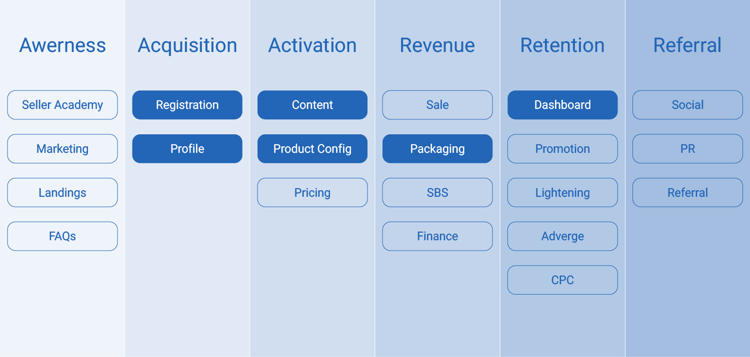
2-2. Enhancing critical flows

After prioritizing the user flows based on GA data, our engagement model, and the critical role of flows in enabling sellers to sell on Digikala, we focused on the key flows to enhance the experience for sellers and buyers.

3rd Step: Deep Data Gathering

I have made progress in identifying pain points by collecting data on NPS, Conversion Rate, and the Seller Support Center, along with RFM data on our users. To continue our research, I have organized the remaining data collection into two main sections, consisting of five steps.
The first section focuses on expert reviews, which involves constructing current user flows and conducting a heuristic evaluation.
The second section revolves around user data, including reviewing screen recordings, administering SUS surveys, and conducting interviews.

3-1. User flows
To gain insights into the complexity of selected critical flows on our platform and identify opportunities for simplification, I have created user flows. These user flows provide a comprehensive overview of the steps involved in the selected processes, enabling us to make informed decisions on improving the user experience. Upon investigating these user flows, it became evident that there are indeed opportunities to simplify and reduce their complexity.

3-2. Heuristic Evaluation
To conduct a thorough evaluation of our selected critical flows, I enlisted the assistance of seven designers, two user researcher, and one product manager from our team. Each team member analyzed the flows against 10 heuristic rules, answering three standard questions for each rule and offering recommendations.
The final results were calculated by averaging the scores provided by all 10 team members. This process allowed us to gain a comprehensive understanding of the strengths and weaknesses of our critical flows and to identify areas for improvement.

3-3. Screen Recording
In order to gain a more profound comprehension of the potential challenges users may encounter, I conducted a thorough review of over 100 screen recordings. Throughout this meticulous process, team members diligently documented any issues that arose, providing comprehensive and detailed information for each one.
The outcome of this review is a comprehensive list of potential challenges, which offers valuable insights into the user experience and identifies specific areas that can be improved upon.

3-4. SUS
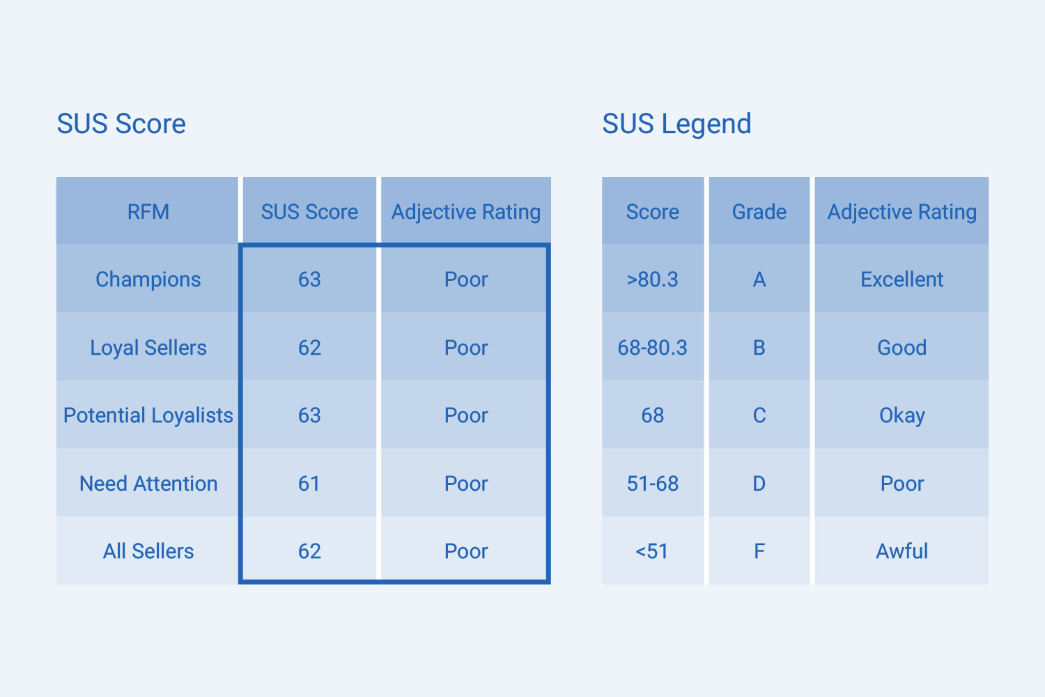
To gain a deeper understanding of the perceived usability of our platform, I selected four main groups of users based on their RFM diagram - champions, loyal sellers, potential loyal, and need attention. I then administered the SUS survey to these groups, receiving approximately 700 responses from our kind users.
To further supplement the SUS questionnaire, I added a descriptive question, which received a response from 90% of our participants. This question provided valuable insights into the issues that users faced, allowing us to prioritize our efforts to improve the user experience.
The final results of the SUS evaluation are presented and grouped by the RFM groups. This presentation allows us to compare the perceived usability of our platform across different user segments and to identify areas for improvement.

3-5. Interviews
Based on the results of the RFM diagram and the descriptive question in the SUS survey, our research team and I selected 20 users for in-depth interviews. These interviews lasted approximately 20-30 minutes each, and the main objective was to gain a deeper understanding of the issues that had been identified.
In addition to the four user groups selected from the RFM diagram, we also interviewed five new users to gain insights into issues related to the registration flow. Through these interviews, I was able to gather valuable information about the user experience, providing a more complete picture of the challenges faced by our users.


4th Step: Data Analysis
In an effort to provide a comprehensive solution to the various issues faced by users while working with the panel, we have taken a structured approach to categorize and rate these problems based on their importance. A systematic method of evaluating the severity and impact of each issue is crucial to ensure objective analysis and decision-making.
The method we have employed involves asking a set of standardized questions to each issue, with the objective of determining the extent of its impact on the user experience. These questions are designed to assess the persistence of the issue, its occurrence on a critical path that the user must take, and the level of difficulty in overcoming it.
For each issue, points are assigned based on the answers to the questions. One point is given for each 'Yes' answer, with a maximum of three points possible. The total number of points is then used to determine the rating of the issue, which can range from 'Critical' to 'Low'.
The rating system is as follows:
Critical issue: 3 points
High issue: 2 points
Medium issue: 1 point
Low issue: 0 points
This structured approach not only allows for a clear and objective evaluation of each issue but also provides a roadmap for prioritizing and addressing them in a systematic manner. Additionally, it provides valuable insights into the areas where improvements can be made to enhance the overall user experience.
As an illustration of this process, we have included a list of some of the most pressing general issues that users have reported while working with the panel. This list serves as a starting point for our ongoing efforts to improve the user experience continuously.
Results

After collecting data on the current state of the product with the assistance of the product and research teams, the findings were compelling enough to convince both myself and the entire decision-making body of the commercial department to acknowledge the imperative of initiating the Seller Panel redesign project.

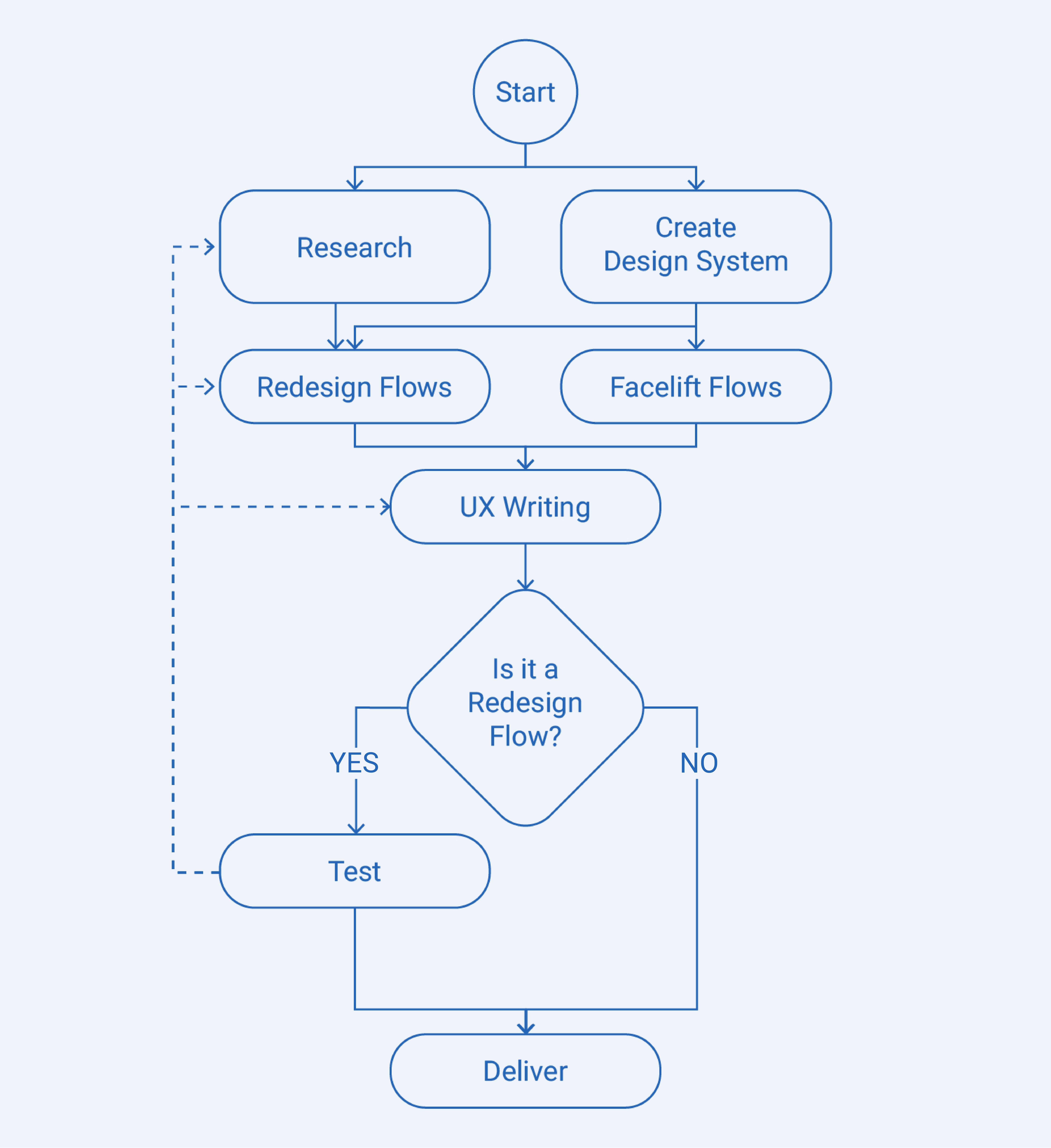
I have formulated two distinct concepts to encapsulate our strategy for the Seller Panel's flows: Redesign Flows and Facelift Flows. The former refers to the crucial five flows that necessitate a complete overhaul, while the latter encompasses all other flows that require a revamp, aligning them with the new design system for both desktop and mobile platforms, incorporating minor enhancements based on Heuristic Evaluation principles. It is important to note that the categorization of flows was not strictly binary, as Facelift Flows often fell somewhere in between these two definitions.

I have divided the revamp process for different flows into two categories based on the aforementioned definitions, and you can observe the overall process in the chart below.


In addition to the UX changes, the technical team also concluded that in order to implement the Seller Panel redesign more effectively and address the issues with the current codebase, a rewrite and technology change were necessary. Therefore, the rewrite process was added to the Seller Panel redesign.
We outlined an estimated roadmap for the entire redesign and rewrite process, with the assistance of the research, product, and technical teams, to present to stakeholders. This roadmap spanned a one-year timeline. However, since it was not feasible to reach a feature freeze state within a year, the decision was made to launch the new product incrementally instead of a big bang approach. In the second half of this one-year roadmap, we aimed to achieve a general feature freeze.
Currently, it has been 10 months since the start of this process, and we have been able to progress 75% of the overall project. A significant number of product flows have been launched, which I will explain in more detail in other case studies.


Want to get in touch?
Drop me a line!

Thank you! Your submission has been received!
Oops! Something went wrong while submitting the form.