Two prototypes, thirty people, one hour each
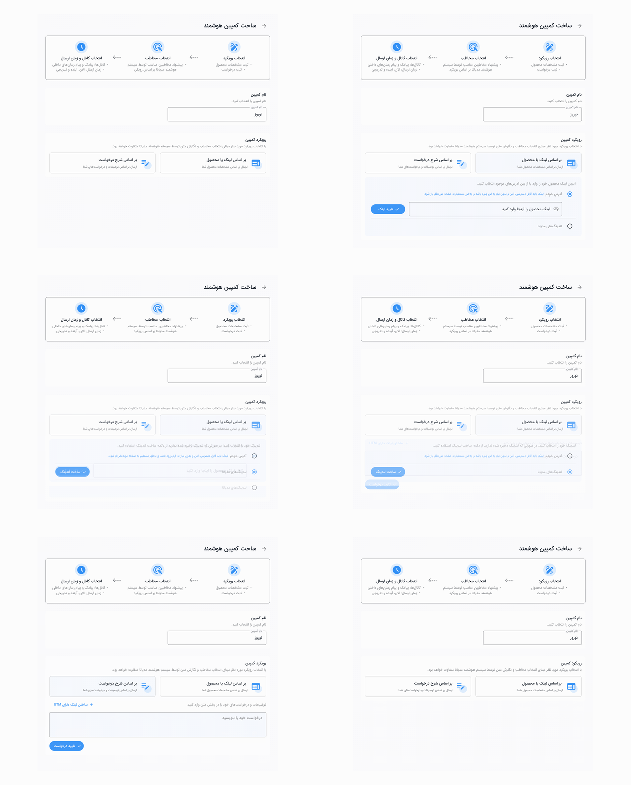
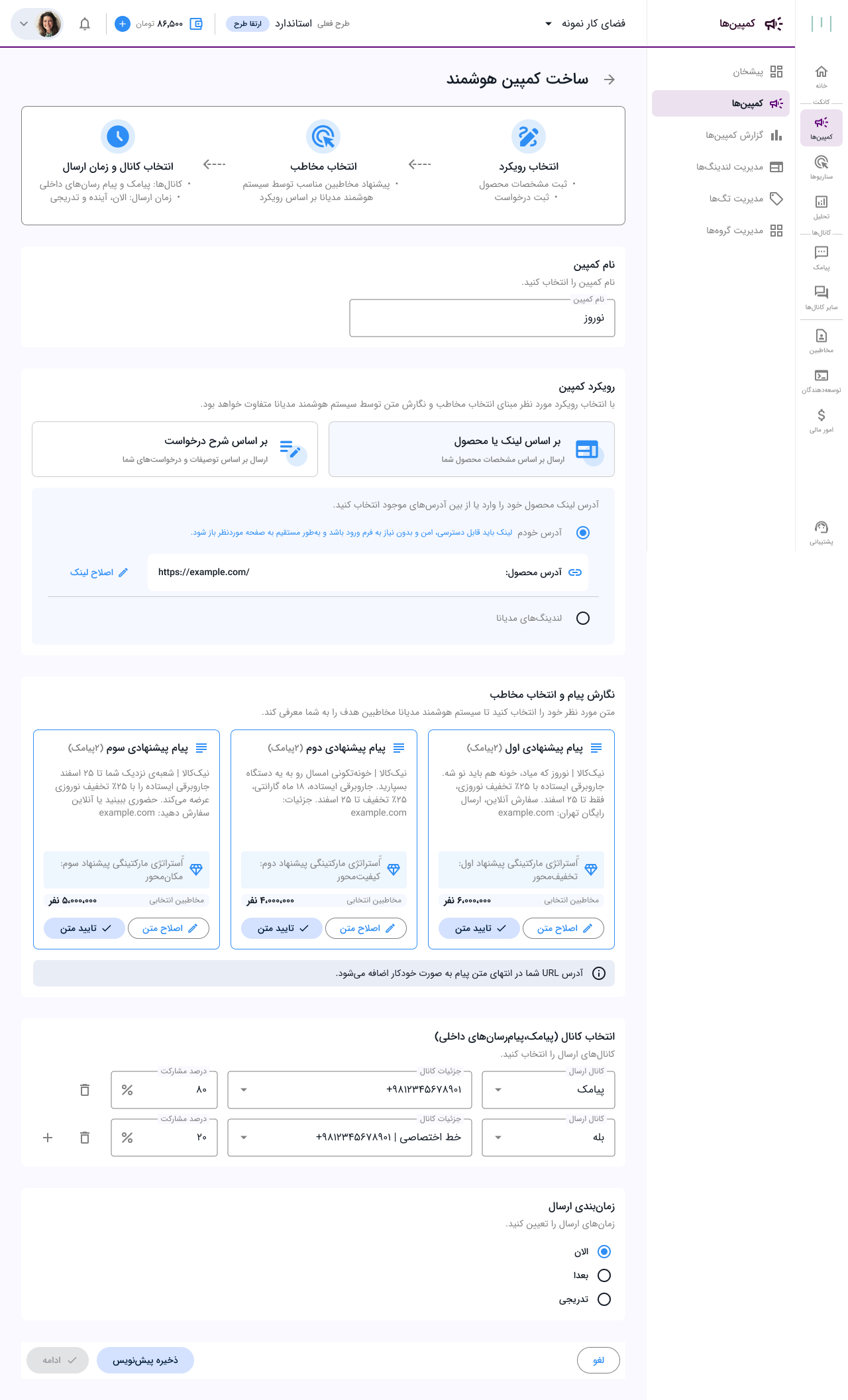
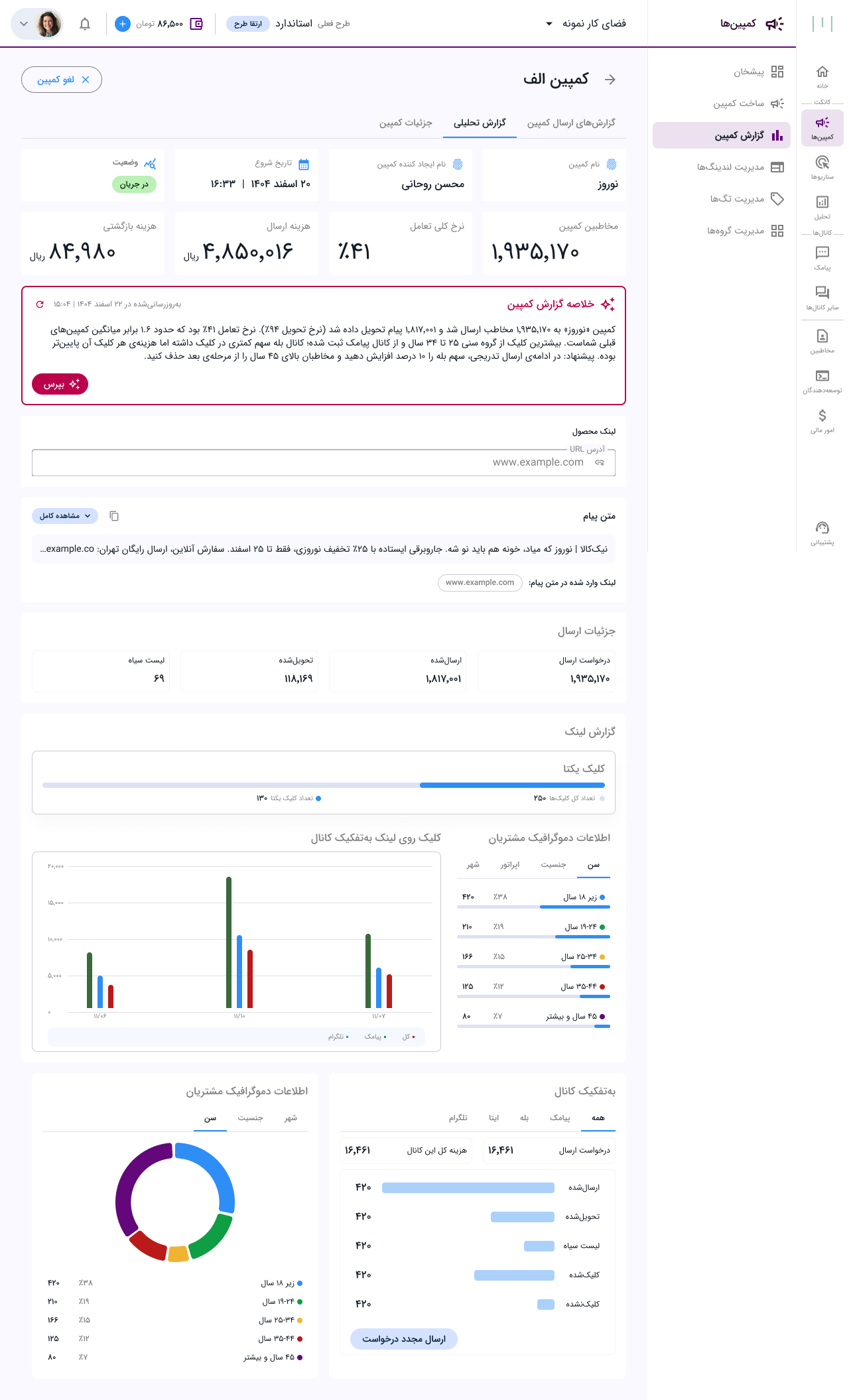
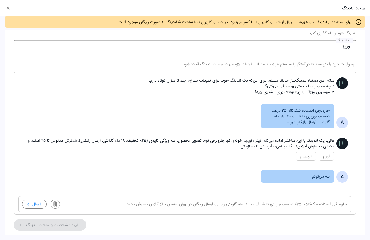
In 2025 the obvious answer was a chat box: describe your goal, get a campaign. It would have been fast to build and it would have demoed beautifully. We had one hypothesis in each hand — a conversational canvas versus a structured, step-by-step flow with AI at the decision points — and no evidence for either. So before committing engineering to a direction, we built both as prototypes and put them in front of users.
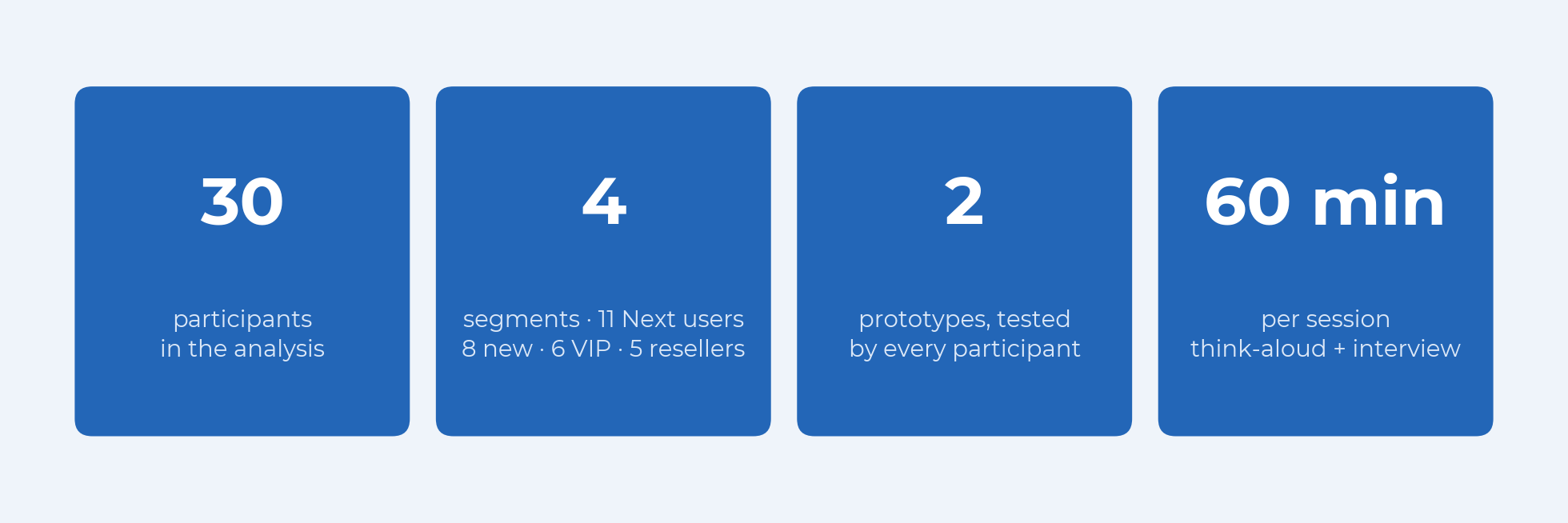
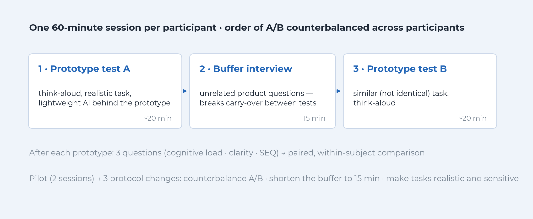
30 participants, 4 segments, one 60-minute session each — both prototypes, same person. Thirty-three were recruited: 11 existing Mediana Next customers, 8 brand-new users, 6 VIP accounts, and 5 resellers, who run campaigns for their own customers from the same panel. The first two sessions were treated as a pilot and one more was excluded as unusable, leaving 30 in the analysis.
Every task had two parts: build the campaign, then correct the system's proposal. Both prototypes had a lightweight model behind them so responses arrived at realistic speed, and each came with its own business scenario: a beauty clinic running a Mother's Day offer for the chat prototype, a café running a football-tournament promotion for the structured one. First, build: a defined audience, a defined offer, a deadline. Then, correct: the proposal comes back with the wrong budget, the wrong channel, too many recipients, or copy in the wrong tone; fix it, and press confirm only when you're sure. The second part matters, because real users don't just create campaigns, they argue with proposals. Participants thought aloud throughout.
The pilot changed three things. We counterbalanced the order of the two prototypes across participants to cancel learning and fatigue effects. We cut the buffer interview between tests from 30 to 15 minutes, because think-aloud sessions ran long. And we rewrote the tasks to include real constraints, after the first two sessions showed that generic tasks produce generic behavior.
What we measured
Three behaviors we watched for, named up front.
Prompt paralysis: long pauses; typing a sentence, deleting it, typing it again, because the user doesn't know what the system wants.
Losing the map: "if I write this, what happens next? Where do I say which channel?"
Perceived effort: the sigh. Does a long form, or an empty chat box, feel heavier?
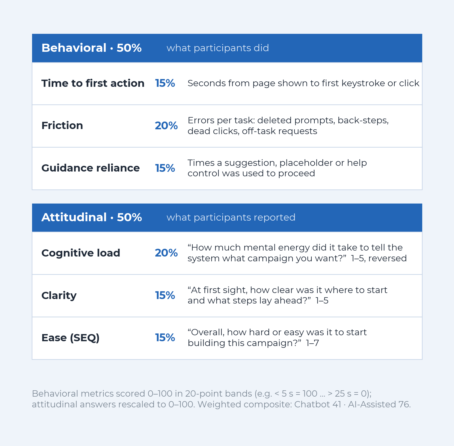
We scored each prototype on six metrics, half behavioral (what people did), half attitudinal (what they told us afterwards), weighted into a single 0–100 score.
What we found
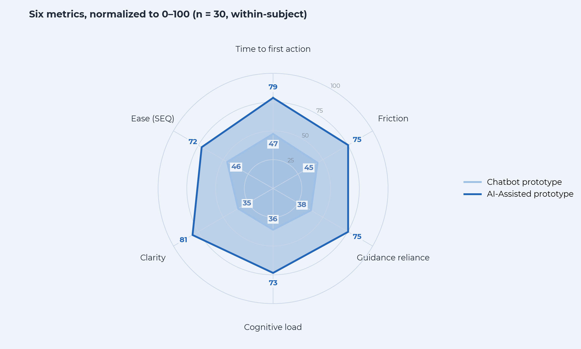
The structured path won on every metric, for every participant.
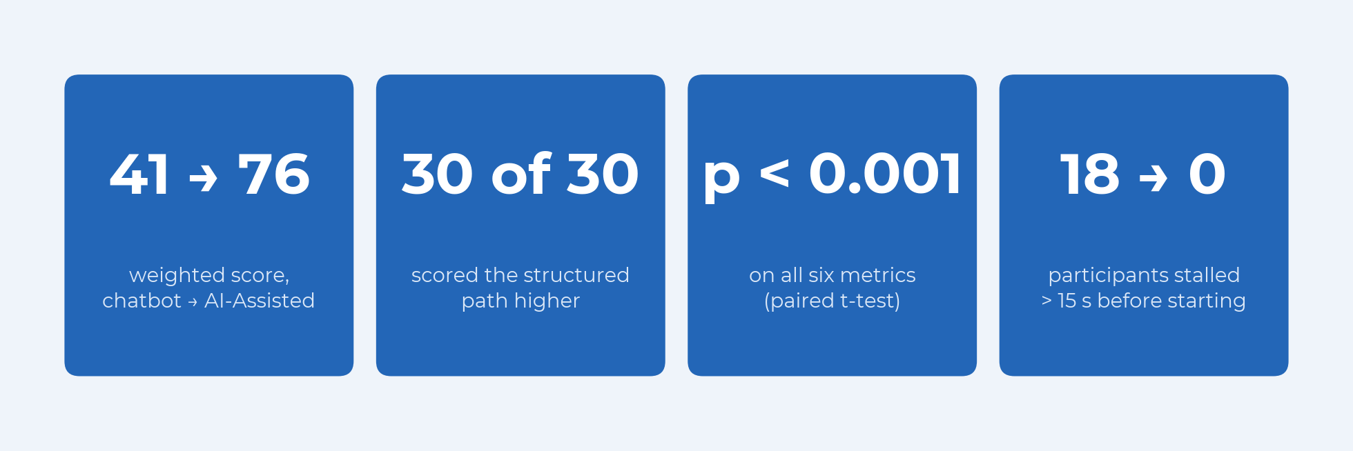
Each of the six differences was significant (paired t-test, n = 30, p < 0.001 across the board), and the composite moved from 41 to 76. The largest gap was clarity, "how clear was it where to start and what steps lay ahead?", from 35 to 81. That is the number behind the whole design decision: the chat box wasn't harder to use; it was harder to place yourself in.
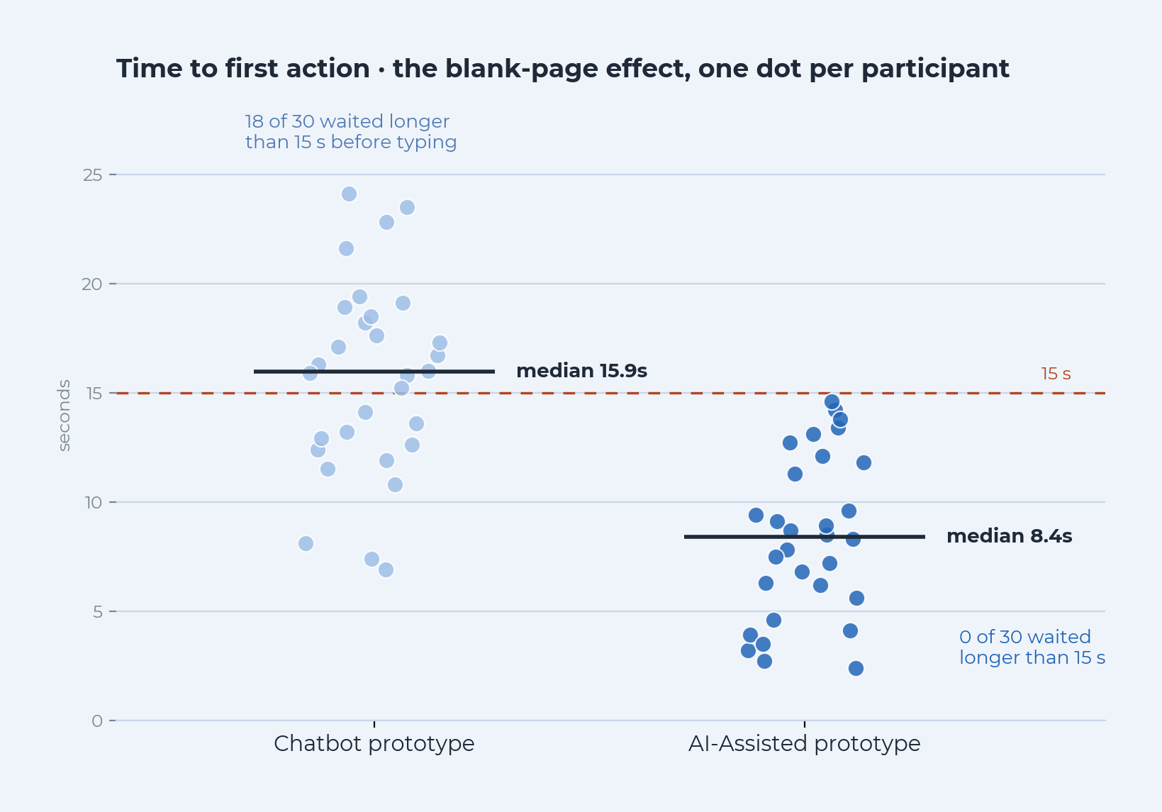
Facing the chat box, the median participant waited 15.9 seconds before doing anything; on the structured path, 8.4. Eighteen of thirty waited longer than 15 seconds in chat; nobody did on the structured path. In the chat prototype, nobody finished a task with fewer than two errors (deleted prompts, back-steps, dead clicks), and 23 of 30 reached for a suggestion or placeholder three or more times just to get started.
What we heard
The numbers say what; the think-aloud said why. Three moments, from three different participants.
“Oh, come on. Here too I have to chat? This is for the generation after mine.
My son only works with these things; I can't make sense of them.”
— on first seeing the chat screen
“So… what happened? Why isn't it loading? Is it stuck?”
— after a 16-second pause on the empty chat box, waiting for the system to make the first move
“If I type this, won't it just go ahead and send the message to those five million people?”
— mid-task in the chat prototype
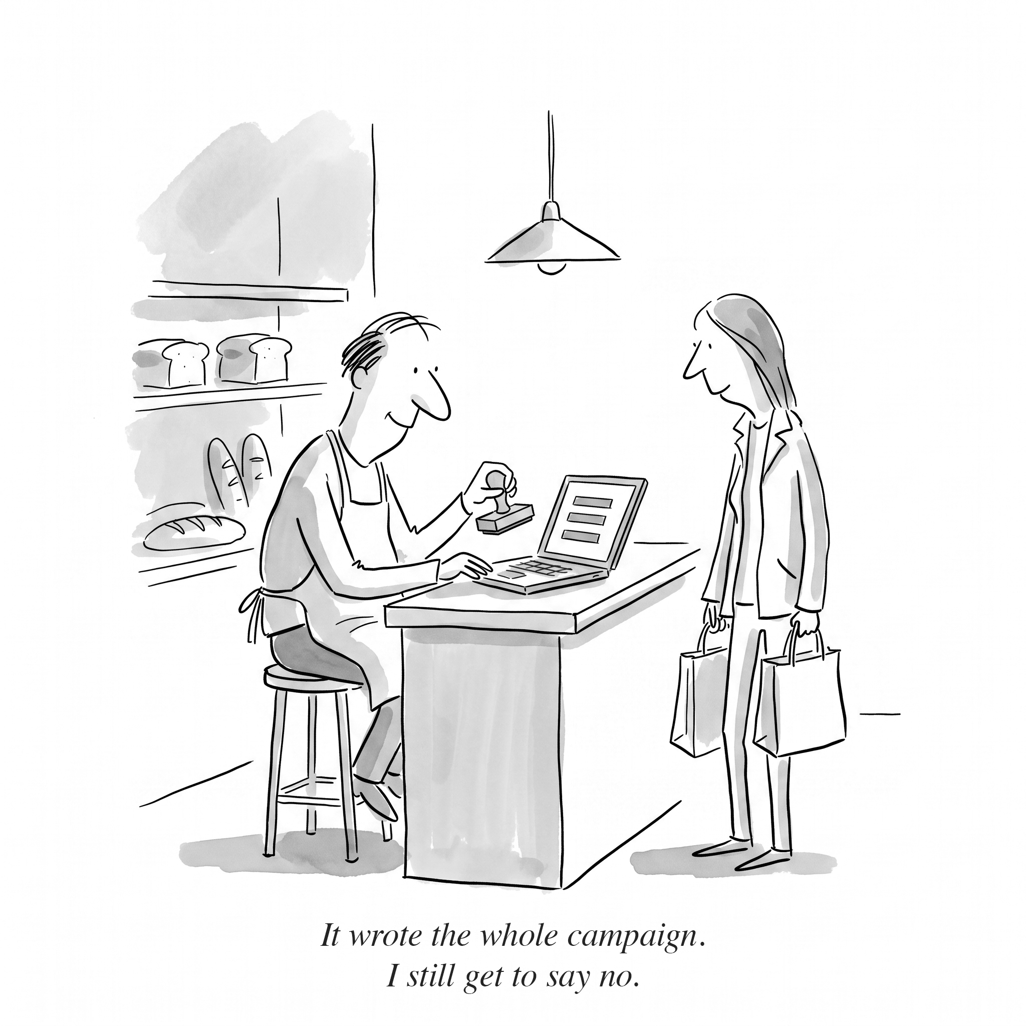
The third quote was the most important sentence in the study. It wasn't about usability. It was about irreversibility: on a platform where every send costs money and cannot be unsent, an interface that might act on its own is frightening no matter how easy it is. That fear shaped the trust architecture below more than any usability score did.